
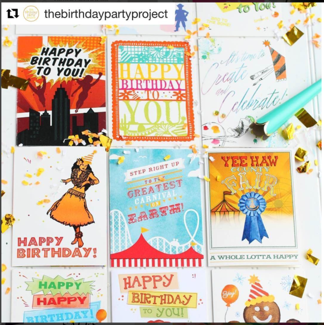
I was assigned to make a social or health issue into an infographic. I chose binge drinking as my topic. This is just a rough computer draft of a 12 page zine. I plan to switch out some of the facts and try to combine facts as well. I was super excited to make a zine. I have never made one before. I loved how simple to make but impactful it could be. These are my default colors so I am hoping to explore more options during my process.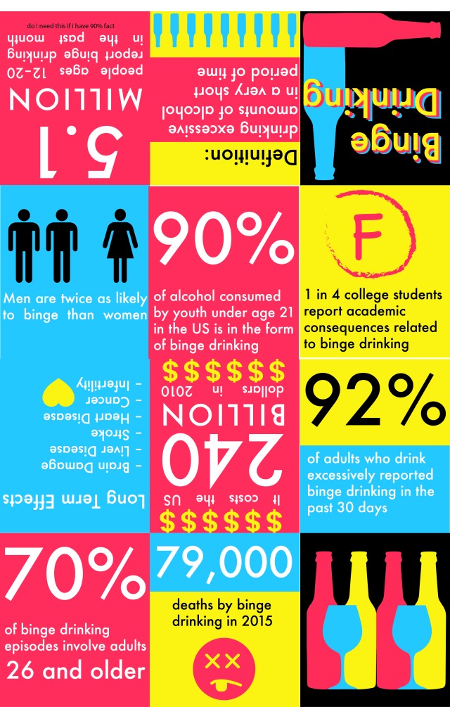
Month: January 2017
Bad Infographics
While I have been looking for good infographics, I have also run across a few bad ones as well. Here are just a few.
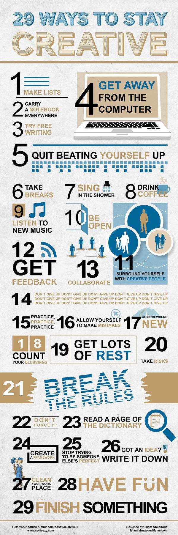
- 29 Ways to Be Creative made by Islam Abudaoud and can be found on http://www.browneyedbaker.com/friday-things-72/
The data is represented with numbers, words and a few simple illustrations. I think this infographic is unsuccessful because nothing really draws you in. The colors are dull, there is a lot on information packed on one page, and the hierarchy competes between the numbers and the actual words. All the illustrations are simple until you get to number 27.
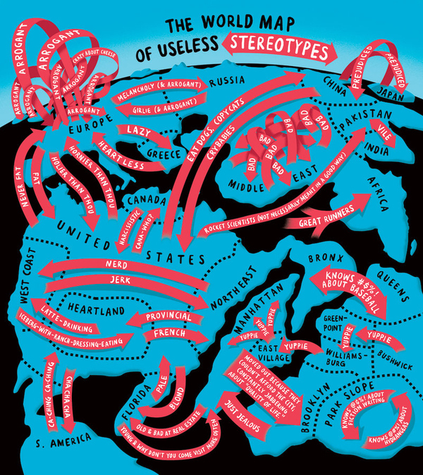
2. World Map of Useless Stereotypes made by Christoph Niemann and found on https://niemann.blogs.nytimes.com/2011/07/06/the-world-map-of-useless-stereotypes/?_r=0#
I love the colors of this infographic and the idea behind it. I think this is unsuccessful because it is hard to read and hard to follow. I don’t know where to start. It is also not an accurate map.
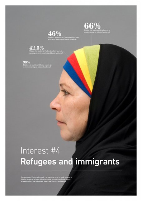
3. Refugee’s and Immigrants found on https://www.seo.com/blog/infographics-vs-infocrapics-the-good-the-bad-the-ugly/
I like the idea behind this infographic. Unfortunately, the data doesn’t add up. That is the only thing making this an unsuccessful infographic.
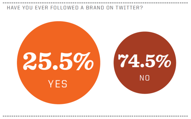
4. Have You Ever Followed a Brand on Twitter posted on http://adesigndive.blogspot.com/2010/11/show-and-tell-infographics-good-bad.html
This is an unsuccessful infographic. The numbers add up to 100% but the circles are the wrong size. The 25.5% should be a smaller circle than the 74.5% because the number is smaller.
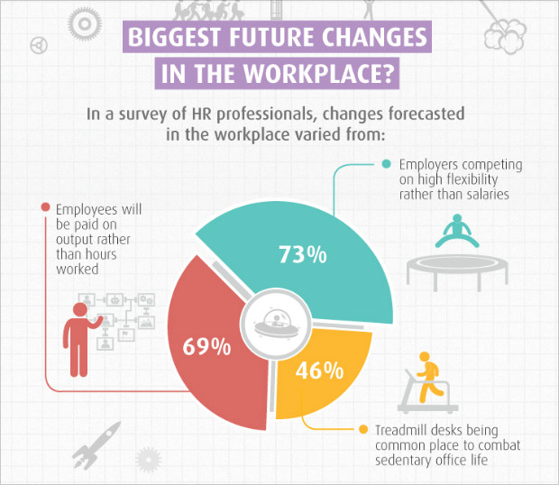
5. Biggest Future Changes in the Workplace found on http://blog.visme.co/bad-infographics/
This infographic is unsuccessful because even thought the portions are in some sort of hierarchy the numbers do not add up to 100%. It adds up to 188%. This makes a false pie chart. The colors work well and the illustration is simplified but the data is incorrect.
Successful Data Visualizations
The following are some of the best data visualizations I have found on Pinterest.
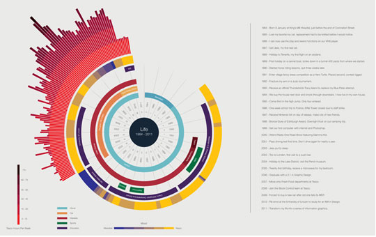
1. Life made by Ben Willers and can be found on http://designbeep.com/2013/03/02/17-beautiful-examples-of-clean-and-minimal-infographics/
Data is represented in lines, bars and words. I picked this as a good data visualization because it is neatly planned out and the colors work together. It is successful because it is easy to read.
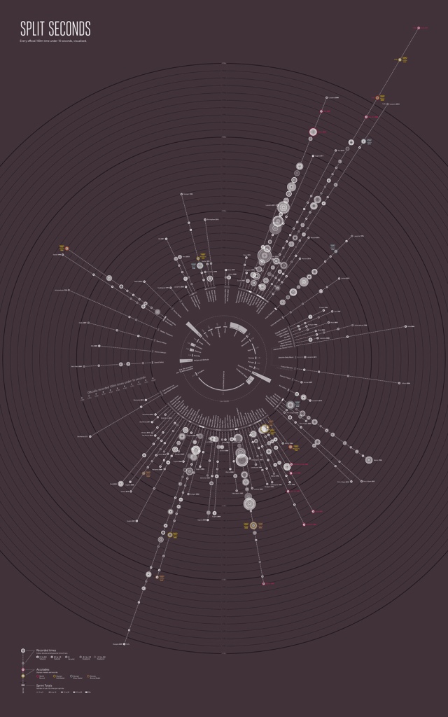
2. Split Seconds made by Paul Butt and can be found on http://signal-noise.co.uk/thinking/over-in-less-than-a-second
The data is represented again with lines and circles. I pick this as a good data visualization because it is interesting to me. I assume you would start in the center to read it. It is successful because it is visually interesting.
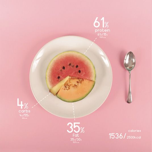
3. Design and Food made by Ryan MacEachern and can be found on http://www.creativebloq.com/photography/designer-charts-his-diet-beautifully-colourful-foods-6133170
Data is represented with food which is interesting to me. I chose this because it was interesting that the designer used food to represent the data. I think it is successful because it draws the viewer in by using real objects.
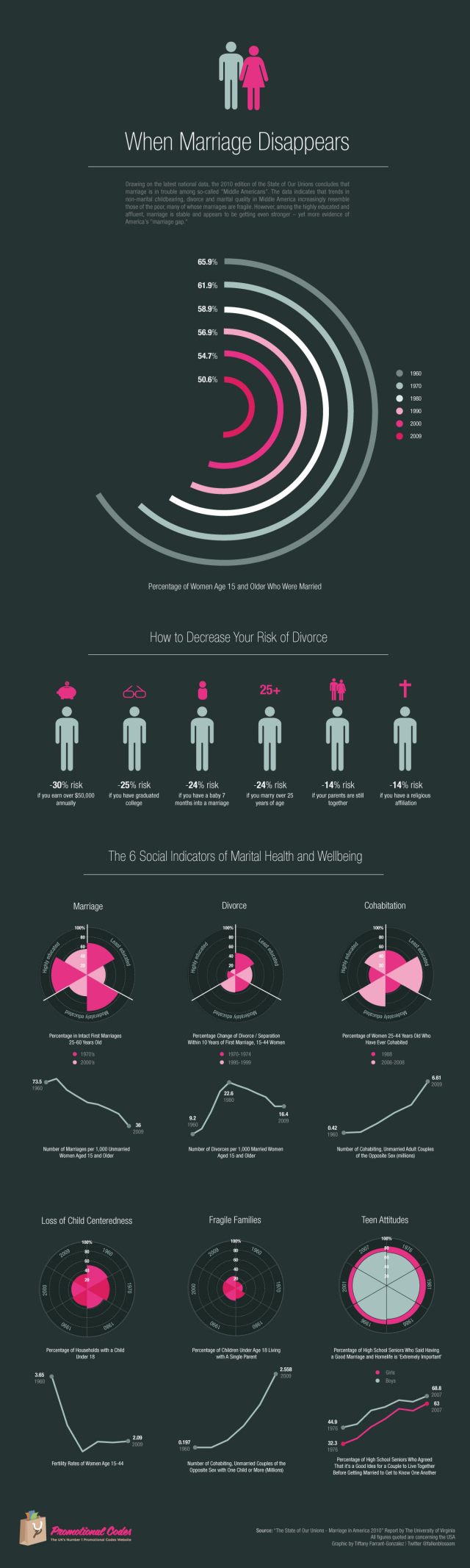
4. When Marriage Disappears under the direction of W. Bradford Wilcox found on http://www.promotionalcodes.org.uk/frugal-blog/22562/when-marriage-disappears-visual-representation-us-marriage-statistics/
The data is represented in graph form, a few with simple illustrations, and little color is used. It is successful because it is well laid out and easy to read. It is successful because it is so simple.
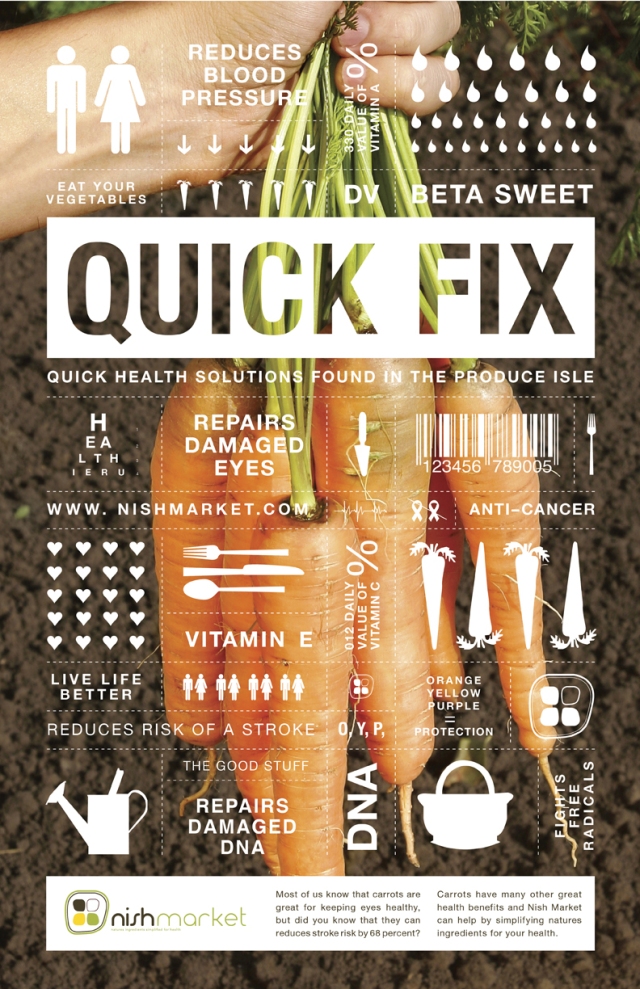
5. Nature’s Cure made by nishmarket found on https://www.behance.net/gallery/4079983/NATURES-CURE
I chose this as a good infographic because it is well laid out and easy to read. It is kept simple and the data is represented in pictures and words. It is successful because it is simple.
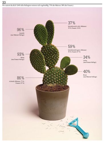
6. Made by Sarah Illenberger found on her website http://www.sarahillenberger.com/work/
Data is represented with a cactus and numbers. It is successful because it is visually interesting, easy to read, and simple. That is why it is good.
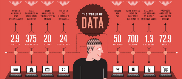
7. The World of Data made by Stephen found on http://stephenslighthouse.com/2010/12/15/data-visualization/
This is a successful data visualization because it is simple and easy to read. The colors work great together which make it successful as well.
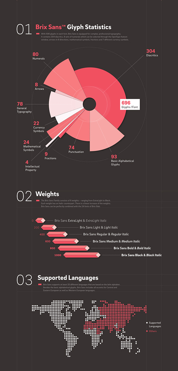
8.Brix Sans Glyph Statistics made by Hannes von Dohren and Livius F. Dietzel and can be found on https://www.behance.net/gallery/19151699/Brix-Sans-(Typefamily)
The data is represented in a graph and on picture. It is successful because it is easy to read and simple which is also why I picked it.
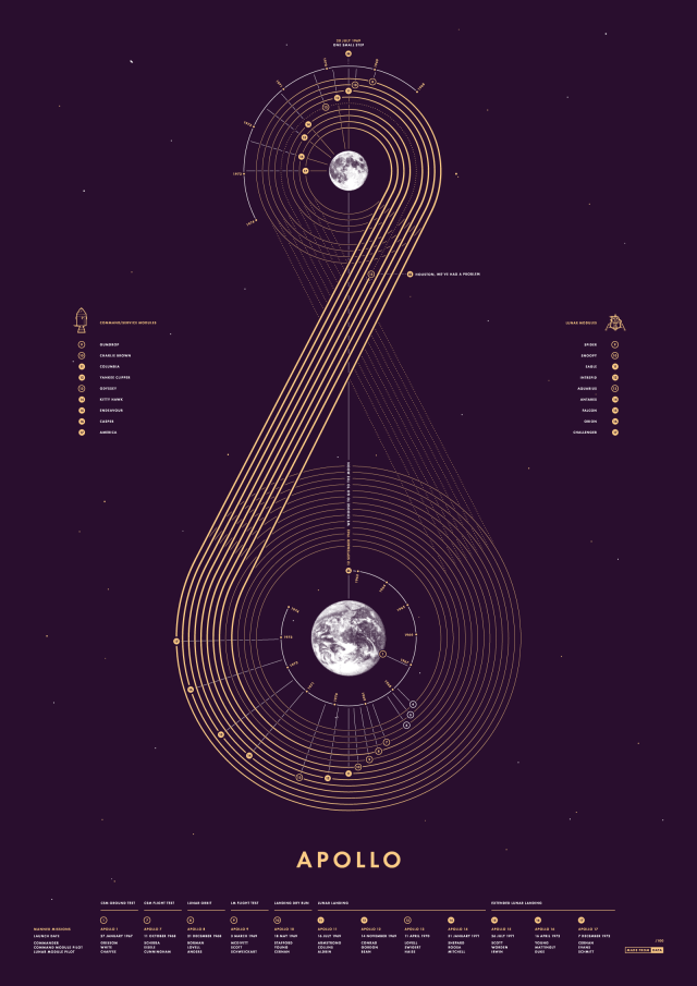
9. Apollo made by Made From Data and can be found on https://www.behance.net/gallery/46234163/Apollo-Screen-Print
I chose this data visualization because it is visually interesting to me in both form and color. The data is represented with a map of the journey. It is successful because it is clean and easy to read for the most part.
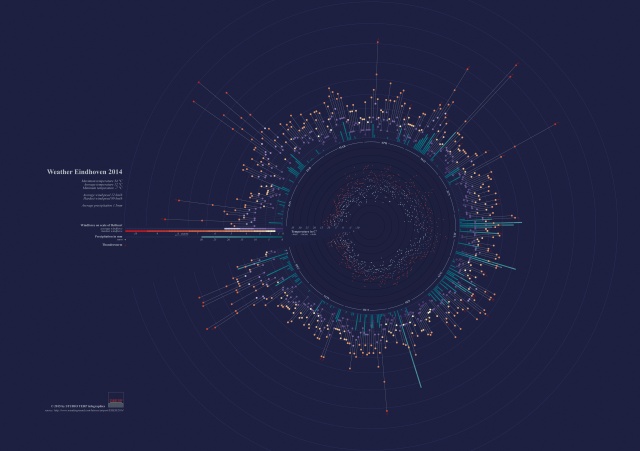
10. Weather Eindhoven made by Studio Terp and can be found on https://www.behance.net/gallery/22539163/Weather-Eindhoven-2014
This is a successful infographic because it it visually interesting. It may not be the easiest to read but the colors are successful and it draws the audience in.
Thanks Again!
Infographics or art
I have put together a list of beautifully design infographics for you to check out.
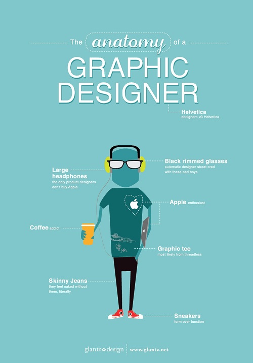
- The Anatomy of a Graphic Designer designed by glantz design and found on http://www.glantz.net
They represent qualitative data visually by using a simplified drawing of a person with everything a graphic designer would have on them. I chose this infographic because I am a graphic designer and according to this chart I fit it to a T somedays. What makes this a successful info graph is the simplicity of it. There is not too much information, the design of a picture is overly simplified, it is easy to read, and the color choices are inviting.
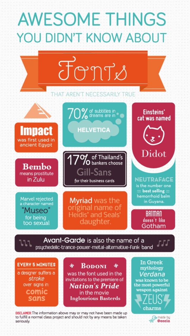
2. Awesome Things You Didn’t Know About Fonts made by @eeelia and can be found at http://visual.ly/awesome-things-you-didnt-know-about-fonts
This infographic represents data by blocking off each fact. I picked this because, again, graphic designer. Even though some of these facts are not true, it is beautifully made. The colors work well together, the mixture of fonts is not unbearable. Since each fact is blocked off, I think it helps with the mix of fonts.
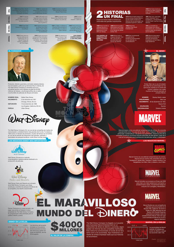
3. Disney vs. Marvel made by D. Israel Peralta and found on behance.net
The data is represents both in pictures and words. The timeline combined with the pictures at the bottom and the one in the center provides a nice balance. The data is nicely separated and it is easy to read and follow. I pick this because I liked the concept of comparing the two. I like how it is split down the middle and Mickey is pictured as himself and Spiderman. It visually caught my attention.
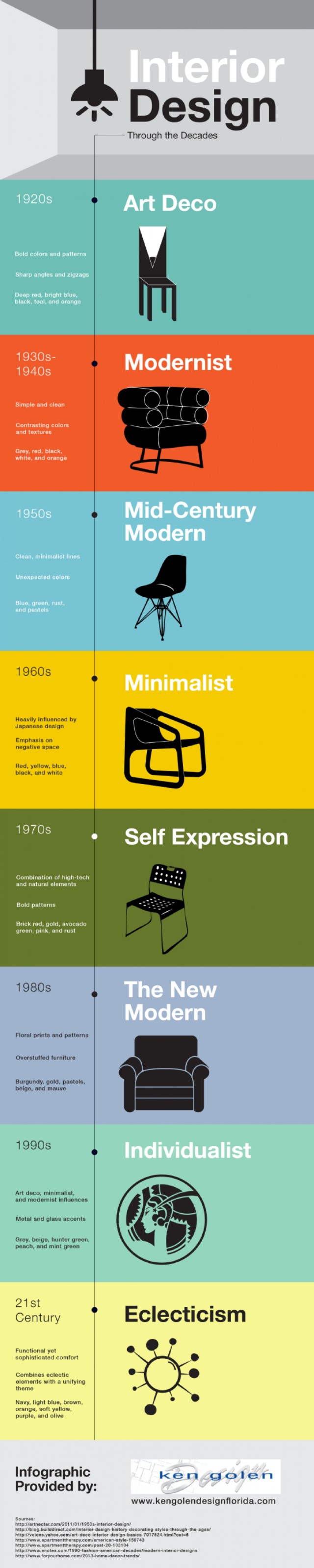
4. Interior Design Through the Decades provided by http://www.kengolendesignflorida.com
The data is represented with pictures as well as simplified illustrations. I picked this infographic because I enjoyed the colors used as well as the simple illustrations. It is successful because it is easy to read. All you have to do is follow the line down the page and read the three or four facts from each decade. It is easy on the eye and not overloaded with information.
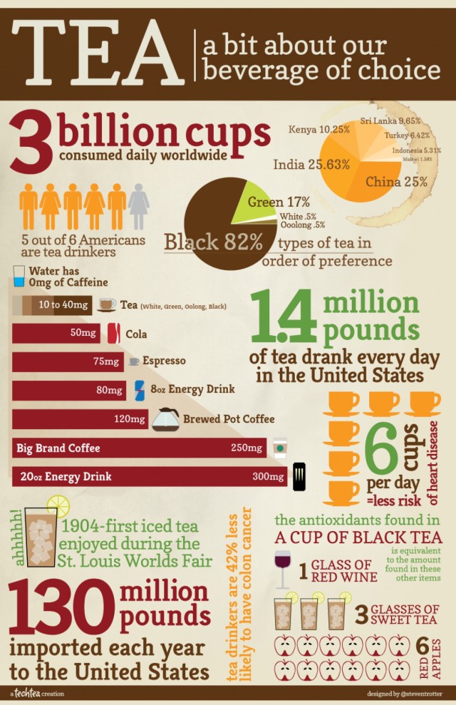
5. Tea a bit about our beverage choice designed by Steven Trotter, found on http://visual.ly/tea-bit-about-our-beverage-choice
They represent data both in numbers, graphs and simple illustrations. I picked this because the information is chunked to gather nicely. All of the information goes together but you can read each chunk separately. It is successful in the same way as well.
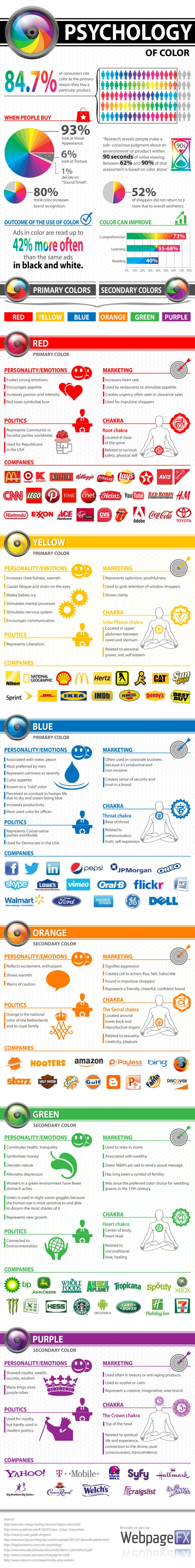
6. Psychology of Color in Marketing made by David Wallace and can be found on https://smallbiztrends.com/2013/04/psychology-of-color-infographic.html
Data is represented in graphs and simple illustrations along with some company logos. I picked this infographic because it is well laid out. It is easy to read, use of color is successful, information is grouped together and easy to follow. The layout also makes this infographic successful.
7. Most Popular and Iconic Home Design Styles made by PartSelect and Ghergich and Co. and found on http://www.partselect.com/JustForFun/Iconic-Home-Design-Styles.aspx
Data is represented in columns and in words. There is a simple illustration of the house that is being talked about for each era. I pick this infographic because it is well designed. The layout is easy to read. The illustration is kept simple and details that are numbered match the description below. This is a successful infographic because the layout is successful and the design is kept simple.

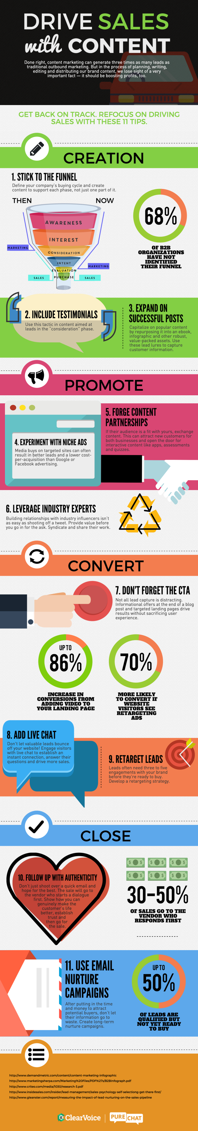
8. Drive Sales with Content made by Clearvoice.com and found http://www.visualistan.stfi.re/2016/03/drive-sales-with-content-marketing.html?sf=xzozwdy#aa
The data is represented by simplified illustration and numbers. I picked this because it had a good layout and it was easy to read and follow. Because of this, it also makes it a successful infographic.
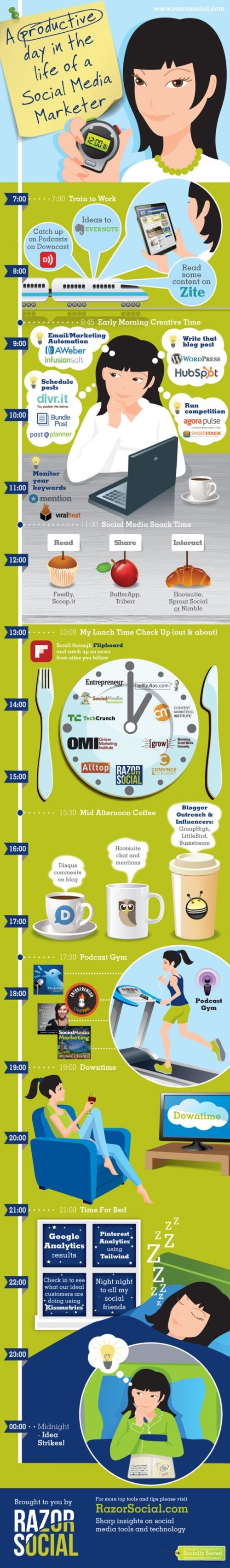
9. A Productive day in the life of a Social Media Marketer made by RazorSocial and found https://iag.me/socialmedia/productive-day-life-social-media-marketer/
Data represented times and images. I picked this as a good infographic because it is easy to follow. It is well designed. The colors work well together, the information also correlates, and the timetable helps the reading. All of these make it successful.
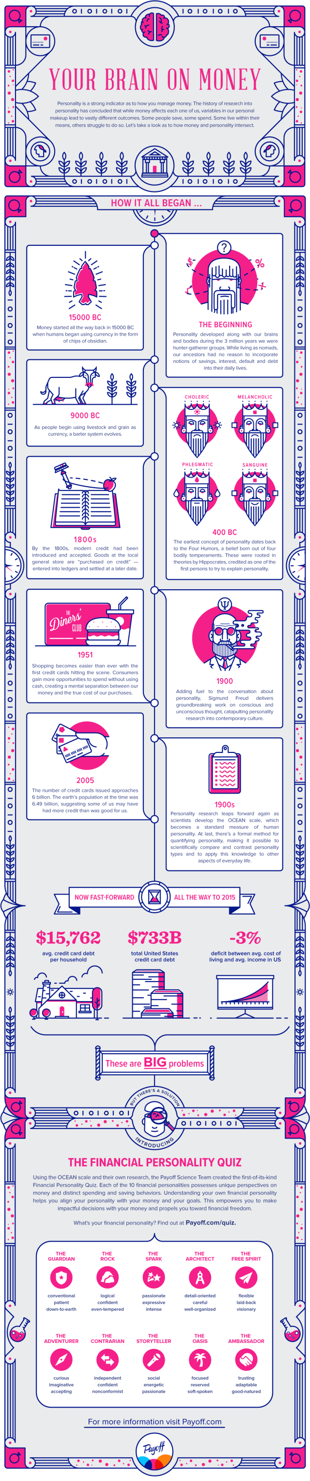
10. The Intersection of Personality and Money provided by Payoff found on https://www.payoff.com/life/science/financial-personality-money/?utm_source=facebook&utm_medium=social&utm_campaign=1603_social&utm_content=1601323
The data is represented with illustrations and words. The data is in its own box. It is successful because it is easy to read and follow. The colors work well together. These make it successful.
Thanks for checking out these beautiful infographics!
Inspired by… Me
I am back at it again, not with the white Vans, but with blogging and man does it feel good! My instructor wanted to know what inspired me. He could look at my 1 million pins on Pinterest and learn what inspires me but I narrowed it down to 10.
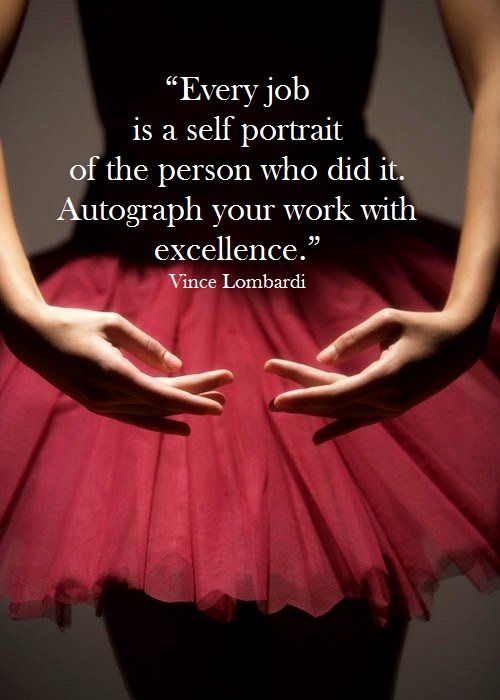
I run on quotes and the meaning I take away from them. Here are some of my favorites!


I also look at street art to get my inspiration flowing. Banksy on the right and the little dude on the right is me everyday.


Jessica Walsh also inspired me. She uses bold colors and pushes the boundaries of design.


Jessica Hische’s typography also inspires me. Her handlettering is gorgeous!
Ceci of New York is someone I follow on Instagram. She does stationery and part of her business gives back in a huge way. Giving back is something I want to do.
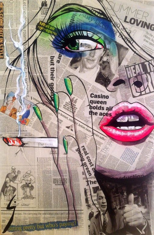
I also look at art pieces to get my creative juices flowing.
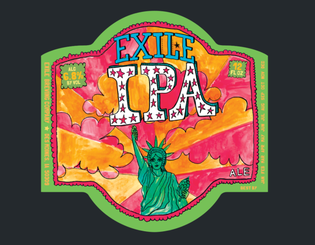
What I enjoy the most and inspires me is craft beer labels. I buy based on the label and my friend makes fun of me but it usually is pretty good.

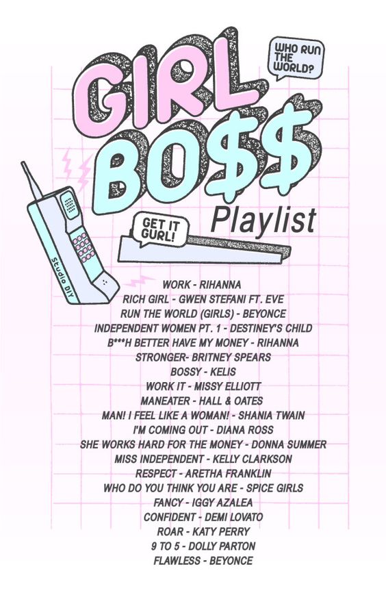
I also listen to music when I work on projects, usually a pandora mix. Sometimes Spotify if I’m feeling it.
This is give or take 10 of the things that inspire me when I work on my projects. This is what makes me tick. These are Inspired by Me.
