
The following are some of the best data visualizations I have found on Pinterest.
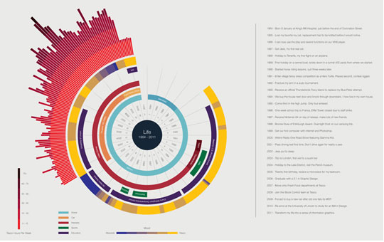
1. Life made by Ben Willers and can be found on http://designbeep.com/2013/03/02/17-beautiful-examples-of-clean-and-minimal-infographics/
Data is represented in lines, bars and words. I picked this as a good data visualization because it is neatly planned out and the colors work together. It is successful because it is easy to read.
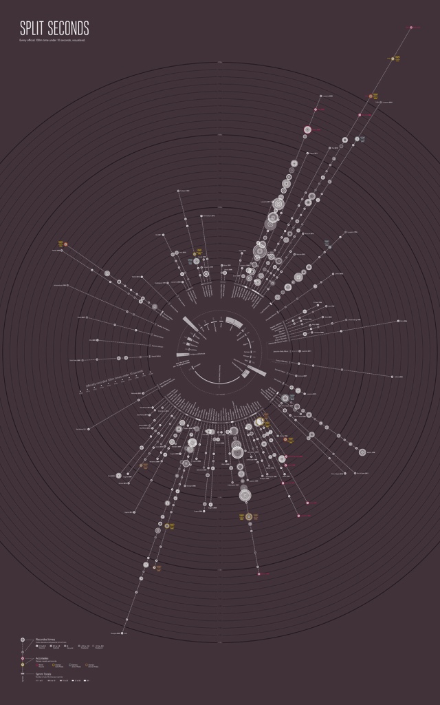
2. Split Seconds made by Paul Butt and can be found on http://signal-noise.co.uk/thinking/over-in-less-than-a-second
The data is represented again with lines and circles. I pick this as a good data visualization because it is interesting to me. I assume you would start in the center to read it. It is successful because it is visually interesting.
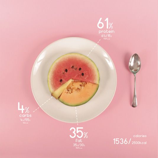
3. Design and Food made by Ryan MacEachern and can be found on http://www.creativebloq.com/photography/designer-charts-his-diet-beautifully-colourful-foods-6133170
Data is represented with food which is interesting to me. I chose this because it was interesting that the designer used food to represent the data. I think it is successful because it draws the viewer in by using real objects.
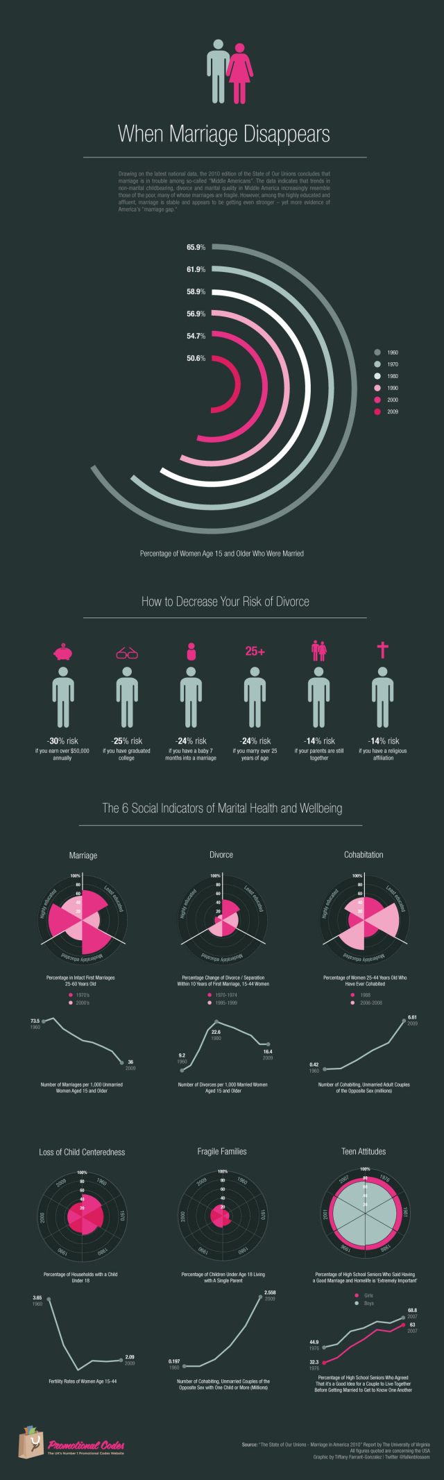
4. When Marriage Disappears under the direction of W. Bradford Wilcox found on http://www.promotionalcodes.org.uk/frugal-blog/22562/when-marriage-disappears-visual-representation-us-marriage-statistics/
The data is represented in graph form, a few with simple illustrations, and little color is used. It is successful because it is well laid out and easy to read. It is successful because it is so simple.
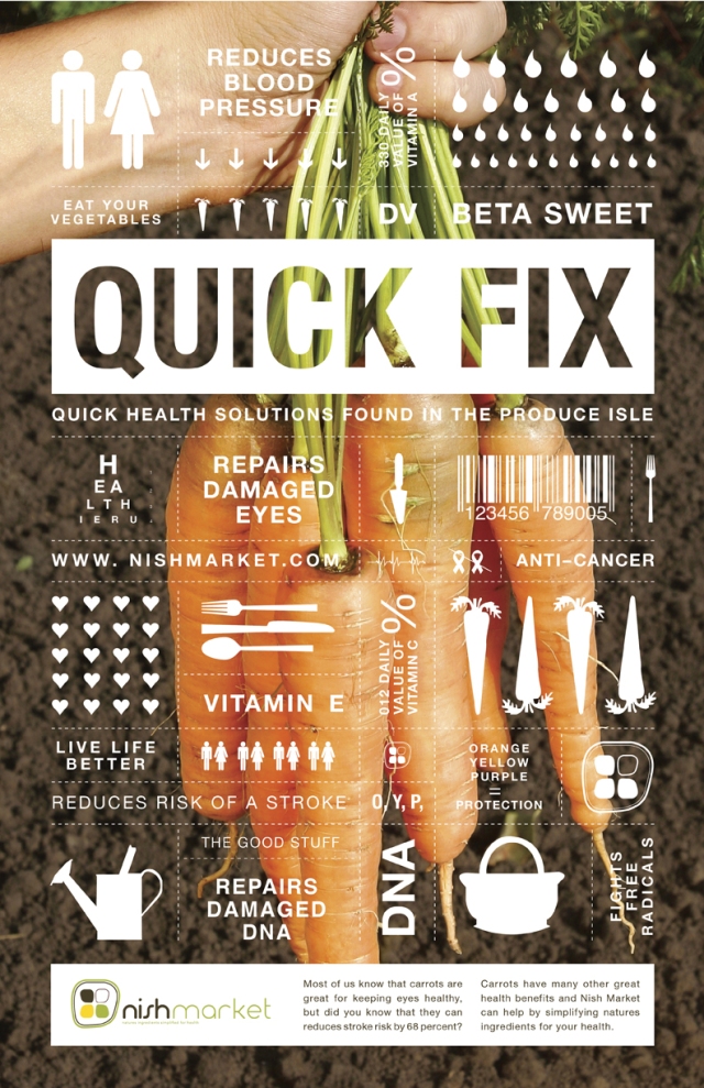
5. Nature’s Cure made by nishmarket found on https://www.behance.net/gallery/4079983/NATURES-CURE
I chose this as a good infographic because it is well laid out and easy to read. It is kept simple and the data is represented in pictures and words. It is successful because it is simple.
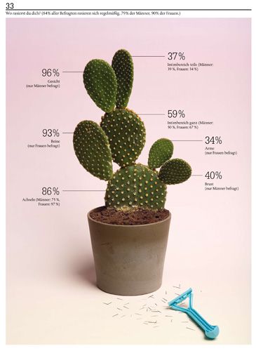
6. Made by Sarah Illenberger found on her website http://www.sarahillenberger.com/work/
Data is represented with a cactus and numbers. It is successful because it is visually interesting, easy to read, and simple. That is why it is good.
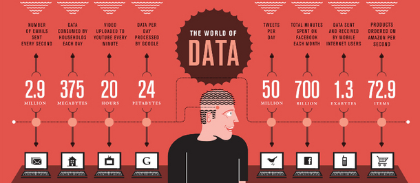
7. The World of Data made by Stephen found on http://stephenslighthouse.com/2010/12/15/data-visualization/
This is a successful data visualization because it is simple and easy to read. The colors work great together which make it successful as well.
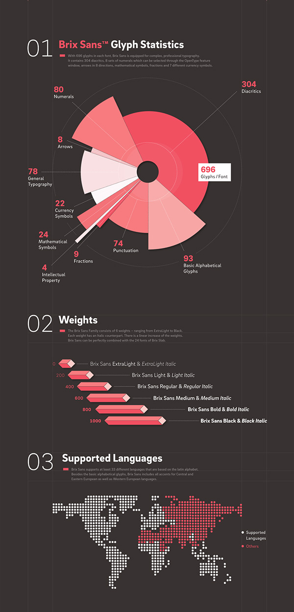
8.Brix Sans Glyph Statistics made by Hannes von Dohren and Livius F. Dietzel and can be found on https://www.behance.net/gallery/19151699/Brix-Sans-(Typefamily)
The data is represented in a graph and on picture. It is successful because it is easy to read and simple which is also why I picked it.
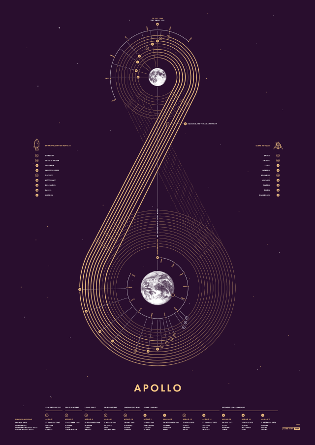
9. Apollo made by Made From Data and can be found on https://www.behance.net/gallery/46234163/Apollo-Screen-Print
I chose this data visualization because it is visually interesting to me in both form and color. The data is represented with a map of the journey. It is successful because it is clean and easy to read for the most part.
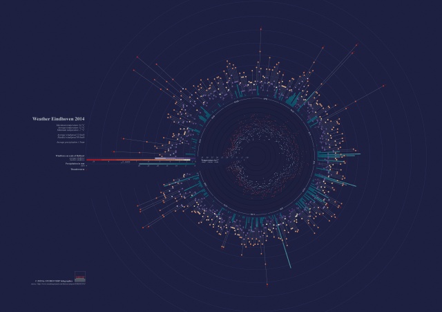
10. Weather Eindhoven made by Studio Terp and can be found on https://www.behance.net/gallery/22539163/Weather-Eindhoven-2014
This is a successful infographic because it it visually interesting. It may not be the easiest to read but the colors are successful and it draws the audience in.
Thanks Again!
