Coffee Everywhere

I was assigned to go to multiple coffee shops around the local area. I was impressed with a few places.  The selections of coffees and the atmosphere.  Here are my findings.

Caribou Coffee

This is a highly traffic coffee shop since it is on a college campus. There are multiple tables in the vicinity for students to study. Usually have a long line for drinks. The audience is mostly college kids and professors. My experience was a decent one. I was able to get through the line and get my coffee within 20 minutes. The staff was nice and accommodating. It seemed there were too many baristas working in a small space. I got a drip coffee dark roast. It was ok. More potent when it was scalding hot. When the coffee cooled, it had a different taste.


Cafe Milo

The audience for Cafe Milo is mostly college students but they do get the occasional family.  They have a rustic feel with exposed ceilings and a double sided fireplace in the middle of the cafe. They offer plenty of seating and outlets at the high top bar. It was a casual place. No aprons just t shirts and jeans or black pants for the baristas. I ordered the pour over coffee which was delicious. It had great flavor and did not leave a bad taste in my mouth. They also offered multiple teas. The only negative was the dim lighting. It made me want to sleep instead of work on homework.


Burgie’s Coffee

I though it would be appropriate to check out the place my class would be “rebranding.” When I visited, it was 9 am on a Friday. The crowd was older people, business people, and then me. I noticed the people going through the drive through were of the younger era. My experience was great. The men upfront were very helpful. Since I just got the drip coffee, the service was pretty fast. Atmosphere was chill even though it is connected to a gas station and bank. They also had exposed ceiling and more of a rustic feel the whole place. The only bad thing was they only had two low counters and there was not a lot of room to see them do a pour over. It was a nice place to get homework done though.


Unfortunately I was unable to visit any cool coffee shops over spring break. My group did stop at multiple Starbucks though.

Starbucks Tennessee

I was not overly impressed with Starbucks but then again I never am. I had there dark roast coffee and did not like it. The atmosphere was geared towards middle aged working people. The service was ok. It did not seem like they knew much about coffee. they were more worried about getting me through the line then really educated me about coffee.
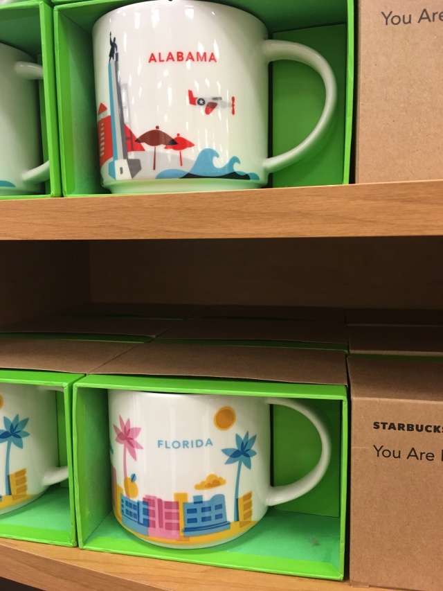
 

Starbucks Alabama

We stopped at a Starbucks inside of a Target before heading back to Iowa. Again not overly impressed with the service here. I simply got the medium roast coffee. Which I discovered I like a lot more than the dark or light roast. My friend ordered a drink and ended up getting the wrong one. They were pretty busy. Since it was inside of a Target there wasn’t a lot of seating or waiting area which made it cramped while waiting for drinks. I was able to get a cute mug though from the travel collection. Not a huge Starbucks fan but this is a cute idea.

IMG_6949

I do have one more place to visit since I have to be home for an interview. There is a local roaster in Peosta, Iowa called Verena Street. I hope to visit there vicinity after my interview and enjoy a Cow Tipper Pour over. I will be posting that tomorrow!

Coffee at its Finest

My assignment for the week was to go out and try coffee shops. Try the coffee, enjoy the atmosphere, and take notes. I was also assigned to research coffee shops nationally and internationally. Get to know the brands. Well, I’m writing this post from a local coffee shop and I feel like I’m cheating on them with every new coffee shop I search. What I found when researching was I could tell which coffee chains were chains just by there websites. They were focused on the final product, coffee in a cup. The non chain shops were focused on the process of making the coffee. I linked websites to the shops and some brand identity blogs that I found helpful for this project. Enjoy!

National Brands
Starbucks story: http://worksdesigngroup.com/brand-redesign-evolution-starbucks/
https://www.starbucks.com

Caribou Coffee: https://www.behance.net/gallery/9098603/Caribou-Coffee
http://www.cariboucoffee.com/home

Dunkin’ Donuts: https://www.dunkindonuts.com/dunkindonuts/en.html

Blue Bottle: https://bluebottlecoffee.com

Intelligentsia: https://www.intelligentsiacoffee.com

Dog Wood Coffee: https://www.dogwoodcoffee.com

Oddly Correct: http://www.oddlycorrect.com

Ritual Coffee: https://www.ritualroasters.com

Four Barrel Coffee: https://www.fourbarrelcoffee.com

Revelator Coffee: http://revelatorcoffee.com

And now for the international brands.  I could not read most of the websites because I am not fluent in the language but the overall feel of the websites were similar. They all seemed local and welcoming. Each of them were focused on the experience and the coffee unlike chain coffee shops.

International Brands
Kozy Salon Urbain Paris: http://www.kozy.fr

Kaffeine London: http://www.kaffeine.co.uk/Eastcastle/Home.html

Cafe Craft Paris: http://cafe-craft.com/home/craft/

Drop Coffee Roaster Stockholm: http://www.dropcoffee.com

Small Batch Coffee U.K.: http://smallbatchcoffee.co.uk

If you want to do a little more research, here is an article about the 25 coffee shops you should try around the world.

https://www.buzzfeed.com/yezminvillarreal/coffeeshops-you-need-to-see-before-you-die?utm_term=.tr9Xn8jzNM#.neJJaV5vE0


Visual Branding

Our next project is to look at branding.  I have six visual branding concepts pictured below which I appreciate. They all keep it pretty simple. Even if there is a pattern it is relatively simple. It enhances the brand and can be used in different ways. The original logo in each is versatile as well which makes the possibilities for using it endless. I have included my every growing Visual Branding board on Pinterest. Check it out for more examples. Click on the Visual Branding part and it will take you straight to my Visual Branding board.


Binge Drinking Final

The picture below ended up being my final poster. It was a little bit of a struggle going from a folding piece to a poster. I feel like if I did not have so many options in the beginning (folding piece, book, etc.) than I could have focused on making the poster better. Is it readable, yes.  Is it well laid out, meh could have been better. Are the facts relevant, yes. Overall, I am satisfied with the amount of time and effort I put in to this project. It is hard to take written facts and give them a personality. Props to those who do it everyday. Would I do this project again? In a heartbeat. I love challenges.

screen-shot-2017-02-27-at-10-42-47-pm

Binge Drinking is Very Bad

I was assigned to make a social or health issue into an infographic.  I chose binge drinking as my topic.  This is just a rough computer draft of a 12 page zine.  I plan to switch out some of the facts and try to combine facts as well.  I was super excited to make a zine.  I have never made one before.  I loved how simple to make but impactful it could be.  These are my default colors so I am hoping to explore more options during my process.backside

Bad Infographics

While I have been looking for good infographics, I have also run across a few bad ones as well. Here are just a few.

  1. 29 Ways to Be Creative made by Islam Abudaoud and can be found on http://www.browneyedbaker.com/friday-things-72/
    The data is represented with numbers, words and a few simple illustrations. I think this infographic is unsuccessful because nothing really draws you in. The colors are dull, there is a lot on information packed on one page, and the hierarchy competes between the numbers and the actual words. All the illustrations are simple until you get to number 27.

902e4243503e2dab145ac689a1c83f2e

2. World Map of Useless Stereotypes made by Christoph Niemann and found on https://niemann.blogs.nytimes.com/2011/07/06/the-world-map-of-useless-stereotypes/?_r=0#

I love the colors of this infographic and the idea behind it. I think this is unsuccessful because it is hard to read and hard to follow. I don’t know where to start. It is also not an accurate map.

world-map-of-useless-stereotypes-30818-1310009359-11

3. Refugee’s and Immigrants found on https://www.seo.com/blog/infographics-vs-infocrapics-the-good-the-bad-the-ugly/

I like the idea behind this infographic.  Unfortunately, the data doesn’t add up.  That is the only thing making this an unsuccessful infographic.

refugees-and-immigrants-infographic

4. Have You Ever Followed a Brand on Twitter posted on http://adesigndive.blogspot.com/2010/11/show-and-tell-infographics-good-bad.html

This is an unsuccessful infographic.  The numbers add up to 100% but the circles are the wrong size.  The 25.5% should be a smaller circle than the 74.5% because the number is smaller.

bad-graphic

5.  Biggest Future Changes in the Workplace found on http://blog.visme.co/bad-infographics/

This infographic is unsuccessful because even thought the portions are in some sort of hierarchy the numbers do not add up to 100%.  It adds up to 188%.  This makes a false pie chart.  The colors work well and the illustration is simplified but the data is incorrect.

wtf-data-viz-1

Successful Data Visualizations

The following are some of the best data visualizations I have found on Pinterest.

1. Life made by Ben Willers and can be found on http://designbeep.com/2013/03/02/17-beautiful-examples-of-clean-and-minimal-infographics/

Data is represented in lines, bars and words.  I picked this as a good data visualization because it is neatly planned out and the colors work together.  It is successful because it is easy to read.

6-life-ben-willers

2. Split Seconds made by Paul Butt and can be found on http://signal-noise.co.uk/thinking/over-in-less-than-a-second

The data is represented again with lines and circles.  I pick this as a good data visualization because it is interesting to me.  I assume you would start in the center to read it.  It is successful because it is visually interesting.

131014_PB_Artwork_for_print_750X1200

3. Design and Food made by Ryan MacEachern and can be found on http://www.creativebloq.com/photography/designer-charts-his-diet-beautifully-colourful-foods-6133170

Data is represented with food which is interesting to me.  I chose this because it was interesting that the designer used food to represent the data.  I think it is successful because it draws the viewer in by using real objects.

e7ff82d14497aca36116bc4edfb62ebc-650-80

4. When Marriage Disappears under the direction of W. Bradford Wilcox found on http://www.promotionalcodes.org.uk/frugal-blog/22562/when-marriage-disappears-visual-representation-us-marriage-statistics/

The data is represented in graph form, a few with simple illustrations, and little color is used.  It is successful because it is well laid out and easy to read.  It is successful because it is so simple.

promotional-codes-marriage-infographic

5. Nature’s Cure made by nishmarket found on https://www.behance.net/gallery/4079983/NATURES-CURE

I chose this as a good infographic because it is well laid out and easy to read.  It is kept simple and the data is represented in pictures and words.  It is successful because it is simple.

1ad09132303851-5605b918265fd

6. Made by Sarah Illenberger found on her website http://www.sarahillenberger.com/work/

Data is represented with a cactus and numbers.  It is successful because it is visually interesting, easy to read, and simple.  That is why it is good.

ee903c66fd26321c6cd490ab8b9b8990

7. The World of Data made by Stephen found on http://stephenslighthouse.com/2010/12/15/data-visualization/

This is a successful data visualization because it is simple and easy to read.  The colors work great together which make it successful as well.

ffunctiondata_visualization-thumb-610x266-25671

8.Brix Sans Glyph Statistics made by Hannes von Dohren and Livius F. Dietzel and can be found on https://www.behance.net/gallery/19151699/Brix-Sans-(Typefamily)

The data is represented in a graph and on picture.  It is successful because it is easy to read and simple which is also why I picked it.

1cfcb219151699-562d5b781a543

9. Apollo made by Made From Data and can be found on https://www.behance.net/gallery/46234163/Apollo-Screen-Print

I chose this data visualization because it is visually interesting to me in both form and color.  The data is represented with a map of the journey.  It is successful because it is clean and easy to read for the most part.

ede8c646234163-584cc1f041041

10. Weather Eindhoven made by Studio Terp and can be found on https://www.behance.net/gallery/22539163/Weather-Eindhoven-2014

This is a successful infographic because it it visually interesting.  It may not be the easiest to read but the colors are successful and it draws the audience in.

20afdc22539163-56314f32bcc4c

Thanks Again!


Infographics or art

I have put together a list of beautifully design infographics for you to check out.

  1. The Anatomy of a Graphic Designer designed by glantz design and found on http://www.glantz.net

They represent qualitative data visually by using a simplified drawing of a person with everything a graphic designer would have on them.  I chose this infographic because I am a graphic designer and according to this chart I fit it to a T somedays.  What makes this a successful info graph is the simplicity of it.  There is not too much information, the design of a picture is overly simplified, it is easy to read, and the color choices are inviting.

1a

2. Awesome Things You Didn’t Know About Fonts made by @eeelia and can be found at http://visual.ly/awesome-things-you-didnt-know-about-fonts

This infographic represents data by blocking off each fact.  I picked this because, again, graphic designer.  Even though some of these facts are not true, it is beautifully made.  The colors work well together, the mixture of fonts is not unbearable.  Since each fact is blocked off, I think it helps with the mix of fonts.

awesome-things-you-didnt-know-about-fonts.jpg

3. Disney vs. Marvel made by D. Israel Peralta and found on behance.net

The data is represents both in pictures and words.  The timeline combined with the pictures at the bottom and the one in the center provides a nice balance.  The data is nicely separated and it is easy to read and follow.  I pick this because I liked the concept of comparing the two.  I like how it is split down the middle and Mickey is pictured as himself and Spiderman.  It visually caught my attention.

disney_vs_marvel_infographic_by_curseofthemoon

4. Interior Design Through the Decades provided by http://www.kengolendesignflorida.com

The data is represented with pictures as well as simplified illustrations.  I picked this infographic because I enjoyed the colors used as well as the simple illustrations.  It is successful because it is easy to read.  All you have to do is follow the line down the page and read the three or four facts from each decade.  It is easy on the eye and not overloaded with information.

interior-design-through-the-decades_513fa386895f7_w1500.jpg

5. Tea a bit about our beverage choice designed by Steven Trotter, found on http://visual.ly/tea-bit-about-our-beverage-choice

They represent data both in numbers, graphs and simple illustrations.  I picked this because the information is chunked to gather nicely.  All of the information goes together but you can read each chunk separately.  It is successful in the same way as well.

1.-Tea-A-Bit-about-Our-Beverage-of-Choice.jpg

6. Psychology of Color in Marketing made by David Wallace and can be found on https://smallbiztrends.com/2013/04/psychology-of-color-infographic.html

Data is represented in graphs and simple illustrations along with some company logos.  I picked this infographic because it is well laid out.  It is easy to read, use of color is successful, information is grouped together and easy to follow.  The layout also makes this infographic successful.

20130408-TopRankTeam-Psychology of colors

7. Most Popular and Iconic Home Design Styles made by PartSelect and Ghergich and Co. and found on http://www.partselect.com/JustForFun/Iconic-Home-Design-Styles.aspx

Data is represented in columns and in words.  There is a simple illustration of the house that is being talked about for each era.  I pick this infographic because it is well designed.  The layout is easy to read.  The illustration is kept simple and details that are numbered match the description below.  This is a successful infographic because the layout is successful and the design is kept simple.

most-popular-and-iconic-home-design-styles

8.  Drive Sales with Content made by Clearvoice.com and found http://www.visualistan.stfi.re/2016/03/drive-sales-with-content-marketing.html?sf=xzozwdy#aa

The data is represented by simplified illustration and numbers.  I picked this because it had a good layout and it was easy to read and follow. Because of this, it also makes it a successful infographic.

9945bb5d513e2e11c491c5647de5f183

9. A Productive day in the life of a Social Media Marketer made by RazorSocial and found https://iag.me/socialmedia/productive-day-life-social-media-marketer/

Data represented times and images.  I picked this as a good infographic because it is easy to follow.  It is well designed.  The colors work well together, the information also correlates, and the timetable helps the reading.  All of these make it successful.

ADayInTheLife_Infographic

10. The Intersection of Personality and Money provided by Payoff found on https://www.payoff.com/life/science/financial-personality-money/?utm_source=facebook&utm_medium=social&utm_campaign=1603_social&utm_content=1601323

The data is represented with illustrations and words.  The data is in its own box.  It is successful because it is easy to read and follow.  The colors work well together.  These make it successful.

financial-personality-money-infographic-payoff

Thanks for checking out these beautiful infographics!

Inspired by… Me

I am back at it again, not with the white Vans, but with blogging and man does it feel good!  My instructor wanted to know what inspired me.  He could look at my 1 million pins on Pinterest and learn what inspires me but I narrowed it down to 10.

I run on quotes and the meaning I take away from them.  Here are some of my favorites!

alberteinstein

vincebikerdude

I also look at street art to get my inspiration flowing.  Banksy on the right and the little dude on the right is me everyday.

Jessica Walsh also inspired me.  She uses bold colors and pushes the boundaries of design.

Jessica Hische’s typography also inspires me.  Her handlettering is gorgeous!

screen-shot-2017-01-10-at-12-39-17-pmscreen-shot-2017-01-10-at-12-40-39-pm

Ceci of New York is someone I follow on Instagram.  She does stationery and part of her business gives back in a huge way.  Giving back is something I want to do.

screen-shot-2017-01-10-at-1-02-19-pm

I also look at art pieces to get my creative juices flowing.

mixedmedia

What I enjoy the most and inspires me is craft beer labels.  I buy based on the label and my friend makes fun of me but it usually is pretty good.

screen-shot-2017-01-10-at-5-06-04-pmscreen-shot-2017-01-10-at-5-45-55-pm

I also listen to music when I work on projects, usually a pandora mix.  Sometimes Spotify if  I’m feeling it.

6517f7575865d3ad35de9c30ab20db89

This is give or take 10 of the things that inspire me when I work on my projects.  This is what makes me tick.  These are Inspired by Me.

Beep, Beep, Beep, Coding…………..

Don’t worry this post has nothing to do with the medical field.  I did not save anyones life.  I’m just on a Grey’s Anatomy kick this month.  But I did learn how to code (a website), a little.  And by a little, I mean my coding skills need to be worked on.

I did do some interesting things with coding but it was nothing more than what I learned in class.  Which is frustrating to me.  I feel like I’m a smart person.  I went to all the websites for help, typed in the code exactly how it was, tried to sample my amazing creations and BAM! Blank page. No type. No piazza.  Just a white screen.  Go back and look at the code to compare it to the help website.  Oh I forgot a semi–colon!  I learned that I am a smart person but getting the computer to do what I want by typing is harder than it looks. If my whole code can be screwed up by one semi–colon, that kinda sucks.  My hat goes off to those who code websites.  Good for you! I’m just going to sit in the corner with my Coding for Dummies book silently getting upset with my computer.  I’m sure I’ll figure it out eventually.  I need to make the time to do it and not get frustrated as easily.  It helped when we did a few exercises in class.  I felt like I knew what I was doing.  Then I got home and complete brain fart.

I think I struggled the most with all of the symbols.  I’m one of those people that has to know what everything means and what it does.  Oh I put a semi colon here, why?  What does it do?  I can use these symbols for more than a winky face?  😉

Some frustration aside, I know coding will become an asset if I learn how to do it.  I’ll just curl up with my Coding for Dummies book every night this summer and keep practicing.