
I have put together a list of beautifully design infographics for you to check out.
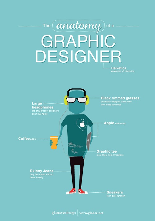
- The Anatomy of a Graphic Designer designed by glantz design and found on http://www.glantz.net
They represent qualitative data visually by using a simplified drawing of a person with everything a graphic designer would have on them. I chose this infographic because I am a graphic designer and according to this chart I fit it to a T somedays. What makes this a successful info graph is the simplicity of it. There is not too much information, the design of a picture is overly simplified, it is easy to read, and the color choices are inviting.
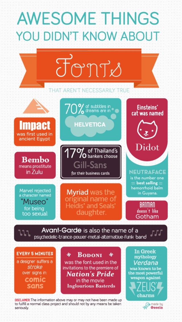
2. Awesome Things You Didn’t Know About Fonts made by @eeelia and can be found at http://visual.ly/awesome-things-you-didnt-know-about-fonts
This infographic represents data by blocking off each fact. I picked this because, again, graphic designer. Even though some of these facts are not true, it is beautifully made. The colors work well together, the mixture of fonts is not unbearable. Since each fact is blocked off, I think it helps with the mix of fonts.
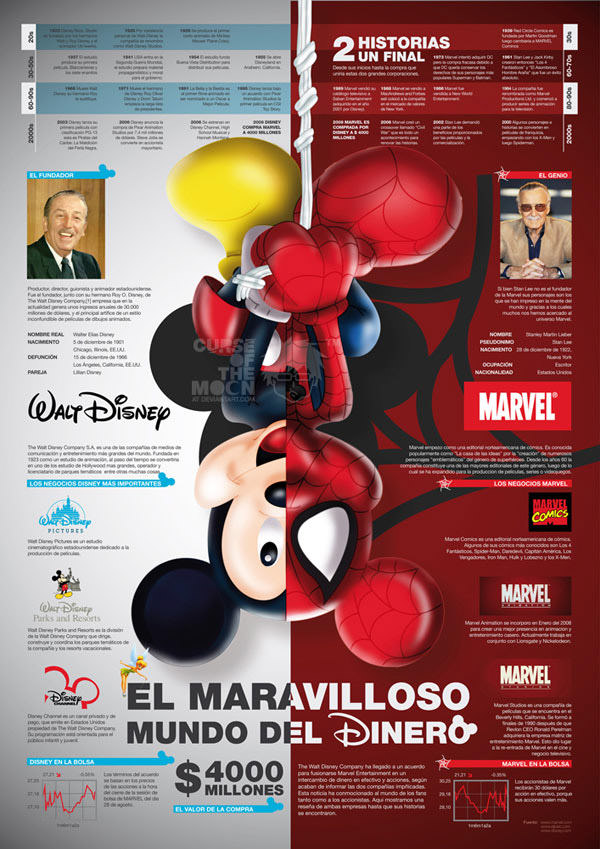
3. Disney vs. Marvel made by D. Israel Peralta and found on behance.net
The data is represents both in pictures and words. The timeline combined with the pictures at the bottom and the one in the center provides a nice balance. The data is nicely separated and it is easy to read and follow. I pick this because I liked the concept of comparing the two. I like how it is split down the middle and Mickey is pictured as himself and Spiderman. It visually caught my attention.
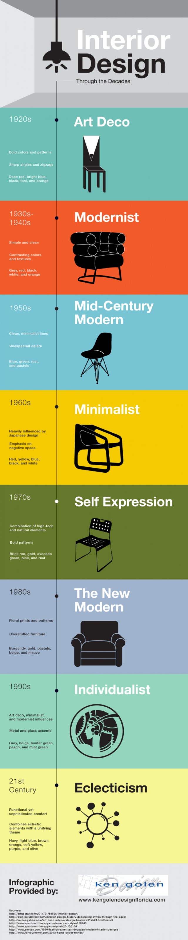
4. Interior Design Through the Decades provided by http://www.kengolendesignflorida.com
The data is represented with pictures as well as simplified illustrations. I picked this infographic because I enjoyed the colors used as well as the simple illustrations. It is successful because it is easy to read. All you have to do is follow the line down the page and read the three or four facts from each decade. It is easy on the eye and not overloaded with information.
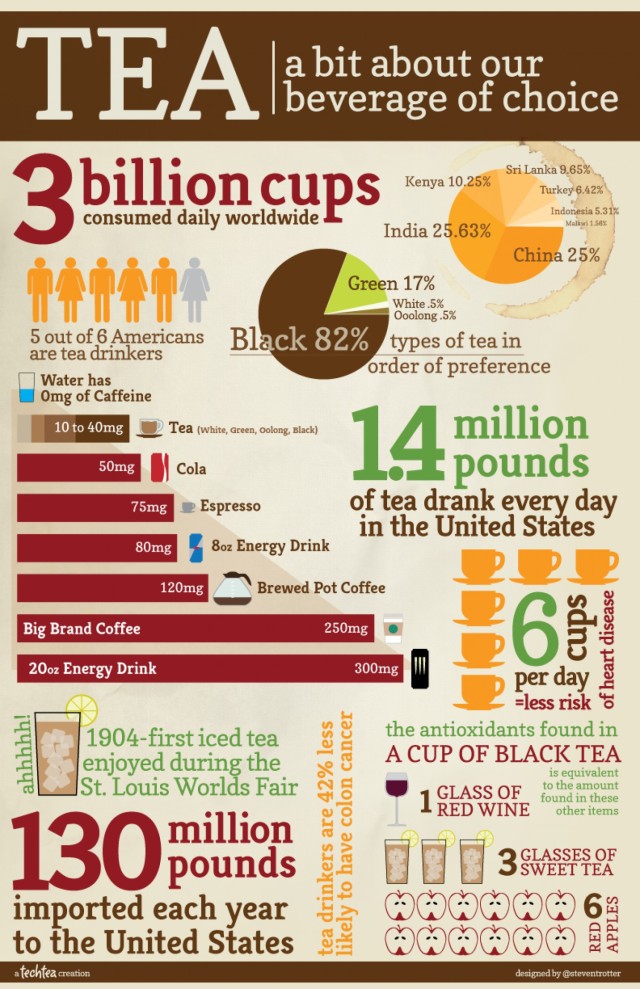
5. Tea a bit about our beverage choice designed by Steven Trotter, found on http://visual.ly/tea-bit-about-our-beverage-choice
They represent data both in numbers, graphs and simple illustrations. I picked this because the information is chunked to gather nicely. All of the information goes together but you can read each chunk separately. It is successful in the same way as well.
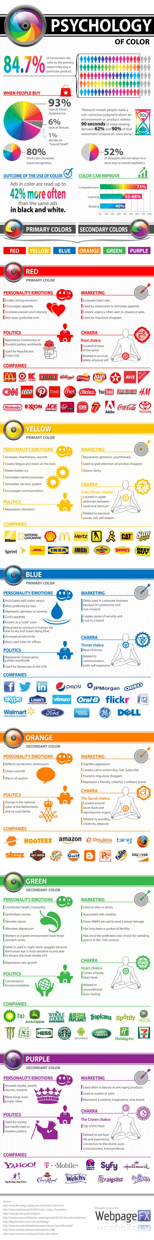
6. Psychology of Color in Marketing made by David Wallace and can be found on https://smallbiztrends.com/2013/04/psychology-of-color-infographic.html
Data is represented in graphs and simple illustrations along with some company logos. I picked this infographic because it is well laid out. It is easy to read, use of color is successful, information is grouped together and easy to follow. The layout also makes this infographic successful.
7. Most Popular and Iconic Home Design Styles made by PartSelect and Ghergich and Co. and found on http://www.partselect.com/JustForFun/Iconic-Home-Design-Styles.aspx
Data is represented in columns and in words. There is a simple illustration of the house that is being talked about for each era. I pick this infographic because it is well designed. The layout is easy to read. The illustration is kept simple and details that are numbered match the description below. This is a successful infographic because the layout is successful and the design is kept simple.

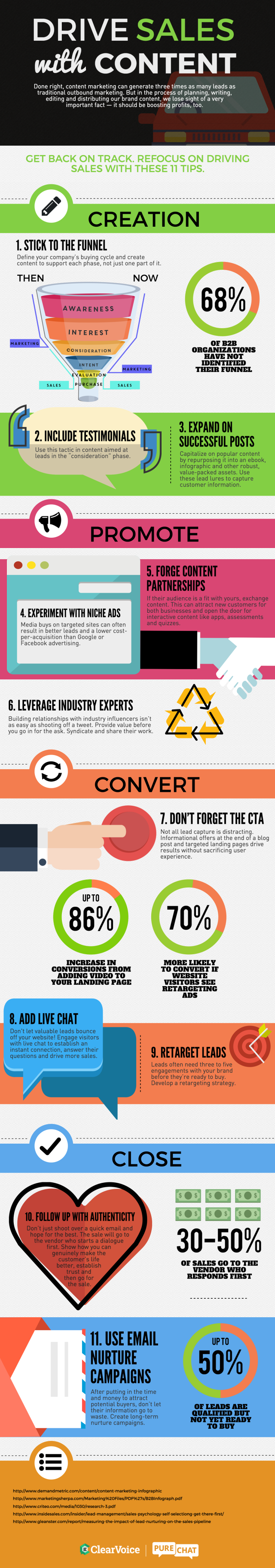
8. Drive Sales with Content made by Clearvoice.com and found http://www.visualistan.stfi.re/2016/03/drive-sales-with-content-marketing.html?sf=xzozwdy#aa
The data is represented by simplified illustration and numbers. I picked this because it had a good layout and it was easy to read and follow. Because of this, it also makes it a successful infographic.
9. A Productive day in the life of a Social Media Marketer made by RazorSocial and found https://iag.me/socialmedia/productive-day-life-social-media-marketer/
Data represented times and images. I picked this as a good infographic because it is easy to follow. It is well designed. The colors work well together, the information also correlates, and the timetable helps the reading. All of these make it successful.

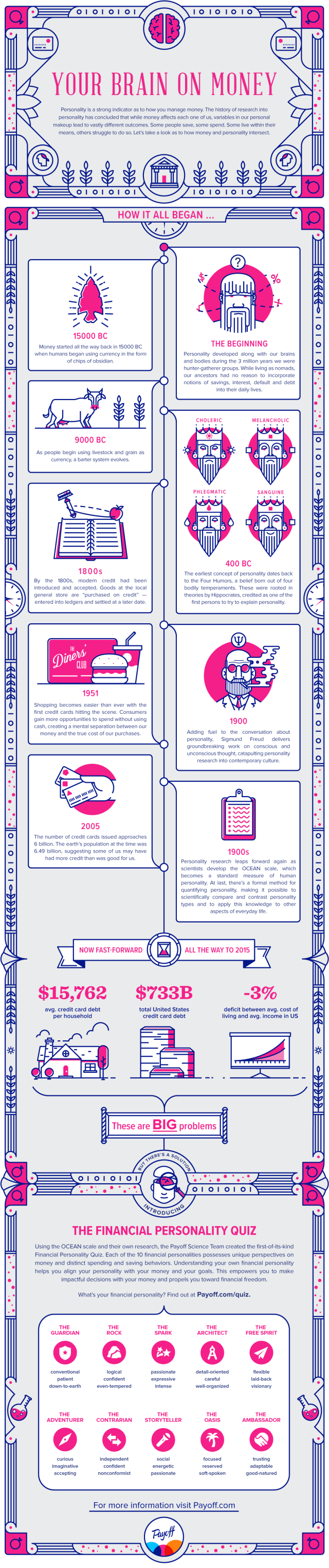
10. The Intersection of Personality and Money provided by Payoff found on https://www.payoff.com/life/science/financial-personality-money/?utm_source=facebook&utm_medium=social&utm_campaign=1603_social&utm_content=1601323
The data is represented with illustrations and words. The data is in its own box. It is successful because it is easy to read and follow. The colors work well together. These make it successful.
Thanks for checking out these beautiful infographics!
